We all know that you don’t always have the budget to pay for a professional designer, especially in small and mid-size companies. On top of that, it often takes time to find a good one. These are exactly the situations when Canva opens the door to successful visual marketing.
Even if you never heard words such as Photoshop or Indesign, you can still work with Canva. It first gained popularity among social media admins and copywriters who produced a lot of low-budget visual content in the online world. It is no surprise that this tool can also be helpful in preparing marketing campaigns for email signatures.
As we have already argued in another article, email signatures can become an unexpected but efficient marketing channel to advertise new products, events, campaigns or deliver other messages.
Get inspired by successful marketing campaigning examples by SignatureSatori:
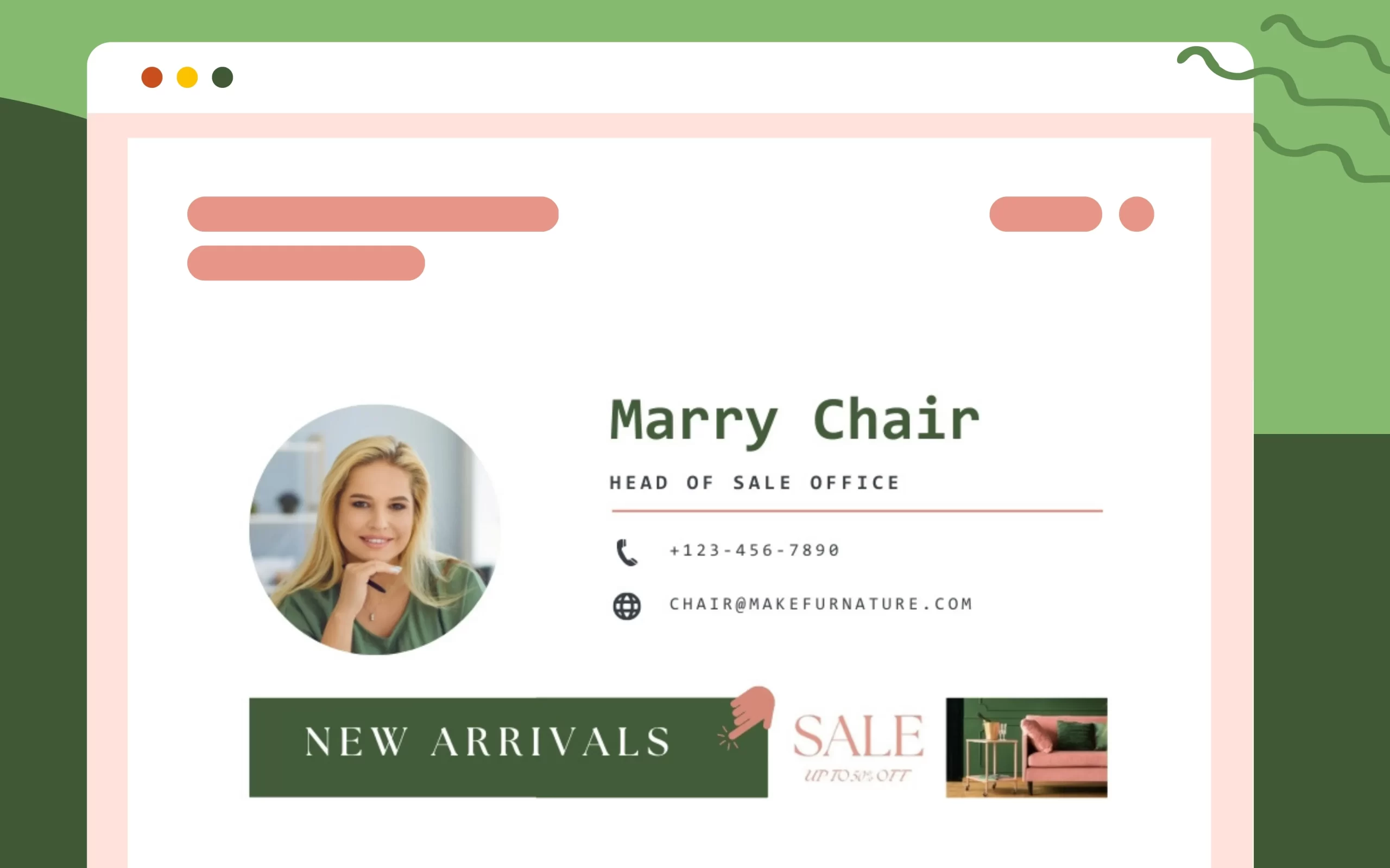
As you can see in the images above, visuals for signatures need a special approach. The space is quite limited since the visual should not surpass the signature itself. You still have to attract attention, though. People should become aware of the campaign even when briefly reading a random email from you. A small banner with a short slogan will be much more efficient since people get the message at first sight.
Of course, it is also advisable to follow basic rules for designers, mainly sticking to brand consistency. Therefore, always use corporate colours (find them in your logo) and in case you advertise your product or event elsewhere (billboards, videos, Facebook, PPC), keep the same colours, same style, and same pictures. Just change the proportions.
How to Start in Canva
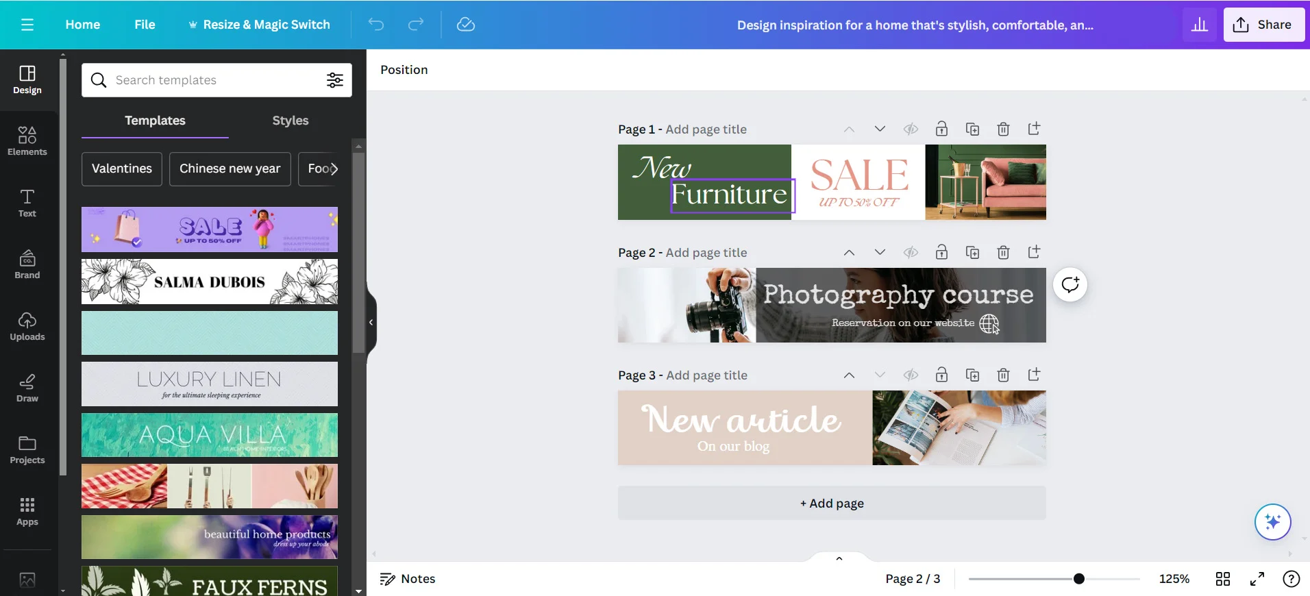
Make your profile with no worries – it is for free and if you don’t want to spend a dollar, you can only choose free designs. Already in? Your first step is picking the proportions of your new design. We recommend two options: either the very thin “leaderboard” (in the category of “Ads”) or a little bigger “e-mail header” (in the category of Social Media & Email Headers). Try to work with both and you will see what fits best.
Leaderboard Examples
E-mail Header Examples
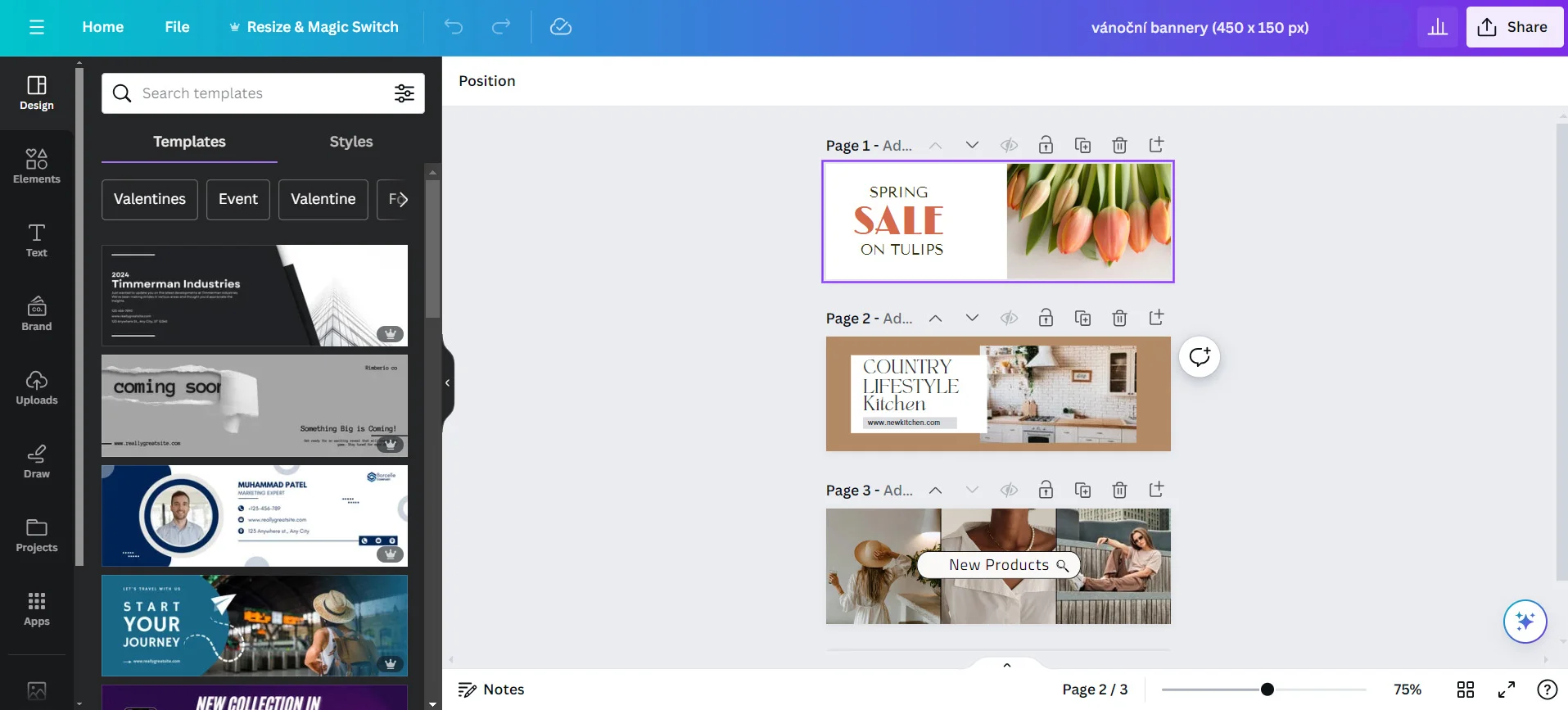
Having specified the proportions, you are immediately offered a large number of designs for inspiration. Always, you can adjust everything – fonts, colors, pictures. Choose the design you like most and start to modify it. You see now that since the “leaderboard” is really thin, your message has to be quite short and powerful. With the format of “e-mail header”, you have a little bit more space.
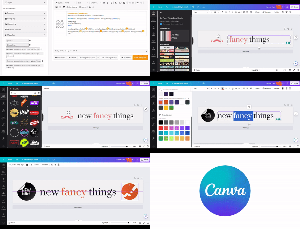
In “uploads”, you may upload your logo, pictures, photographs and all the other things you need for your design. If you don’t have your own pictures, you can use those offered by Canva: pictures, icons, and shapes. Here, some are for free (mostly you can pick one of those), and some are available for one or two dollars. Like that, you can play with your designs in a very user-friendly way. If you have the paid version you can also use tools that include AI (Artificial Intelligence) to change part of a picture or generate a new one. Finished? You can download your design in JPG, PNG, or PDF format or you can directly work with Canva from the SignatureSatori app.
Any trouble? Watch the full process from the beginning till the final design here:
Ask For Feedback
Important notice: Before you open the marketing planner in SignatureSatori, show the final banner to someone. Be it your colleagues or your friends just check the first impressions. As a graphic design beginner, you will appreciate all the feedback you might get and you can always go back to Canva and improve your design. Don’t forget that in SignatureSatori, if you use one-time credits, you pay for every change in the signature. It could get costly to change the design due to unexpected reactions (unless you opt for a monthly subscription, see pricing).
If you’re reading this, we believe you have already started to play with your designs in Canva. Enjoy the freedom to make your own visuals independently on graphic designers and open the door to exploring the possibilities of our marketing planner.

