1. Book Antiqua
Book Antiqua is a typeface with an inscribed tradition and a modern twist. It’s a serif font, which means it has projecting features at the letters’ ends resembling classical typography. The font stands out equally well across devices, so your signature retains its original design, regardless of whether the recipient gets your message on a computer or smartphone.

Readability on various devices is essential for an effective signature. Fortunately, Book Antiqua is designed with clarity, so you can be sure your name and brand will always appear in the best possible light. Compatibility with most email clients then underlines your character with no limits.
When it comes to professional aesthetics, Book Antiqua stands out. It’s sophisticated without being intimidating or old-fashioned. If you want to deliver a message about your proud history or a solid background in your field, then this font is perfect.
In the main text, Book Antiqua goes well with sans-serif fonts like Arial. The contrast between the serif of your signature and the simplicity of the message typeface creates a distinct visual hierarchy and, above all, draws even more attention to your signature.
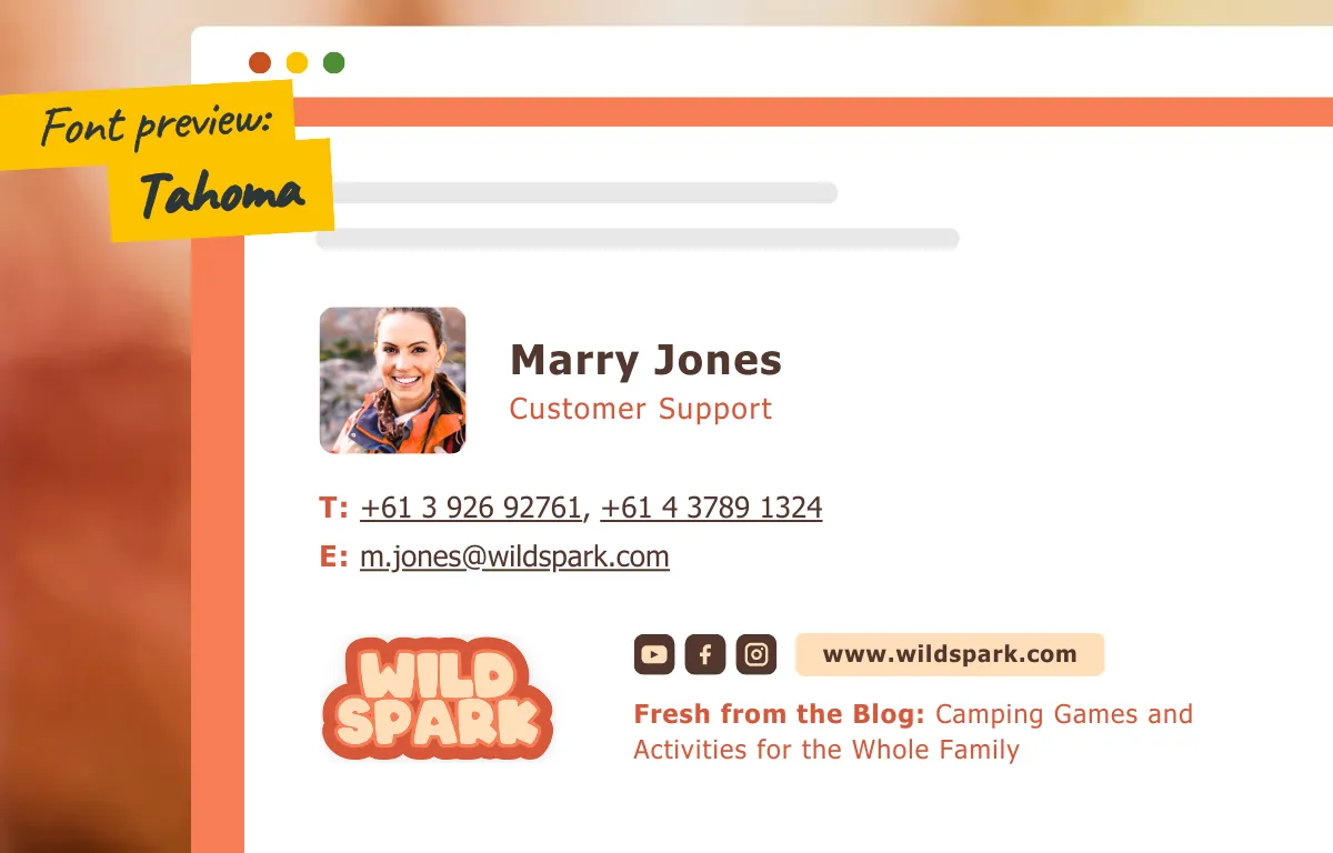
2. Tahoma
Simply modern Tahoma sans-serif font is known and appreciated for its even spacing and weight, which makes the typeface comfortably readable on screens of all shapes and sizes.

Compatibility is a natural part of Tahoma. This is because it’s one of the most common typefaces in both Windows and macOS, so you can be sure about its consistent look across all kinds of devices.
Aesthetically, Tahoma is undemanding yet confident. If your company appreciates simplicity and practicality, your communication is usually straightforward and you want to underline it, then this font is perfect for you.
Use a different sans-serif font like Verdana in the body of your emails. You will maintain an especially clean, modern, and professional look.
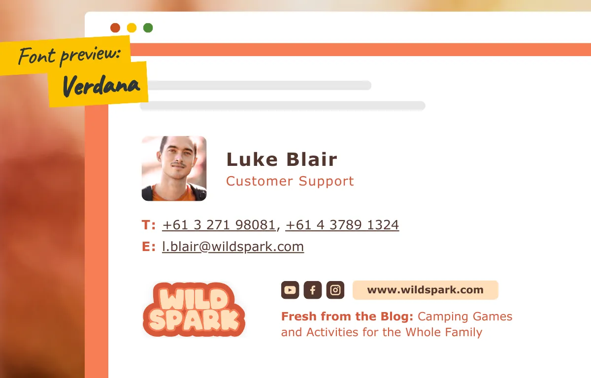
3. Verdana
Verdana is a fresh, elegantly rounded typeface with enough space between individual letters, which makes it easier to read especially on smaller phone screens.

The font maintains its appearance in various email clients, and its aesthetics are perfect for companies that want to show their modern approach and human side. The roundness of each letter evokes a feeling of security.
Combining Verdana in your signature with a sans-serif font like Georgia in the body of your email will give your messages a touch of both friendliness and respect.
4. Palatino Linotype
Palatino Linotype is the distinguished elder of the font family. It’s carefully crafted with gentle serifs and a flowing, broad structure that adds a touch of magnificence while remaining remarkably readable on different devices.

Compatibility with email clients is key, and Palatino Linotype with its widespread support helps to ensure that your signature arrives in all the glory.
Aesthetically, the Palatino Linotype embodies dignity. If you wish to underline your company experience and wisdom without sacrificing modernity, this typeface will suit your needs.
Pair Palatino Linotype with a light sans-serif like Helvetica for your main text, and you’ll send a message that’s classic and contemporary at the same time, with a bold yet courteous tone.
Choosing Between Serif and Sans Serif Fonts
It’s well known that serif fonts are better for paper-based publications, while sans serif fonts are better for reading on a computer screen and are considered “cleaner” or minimalist, but it is up to you to decide which font feels more natural for your brand’s signature.
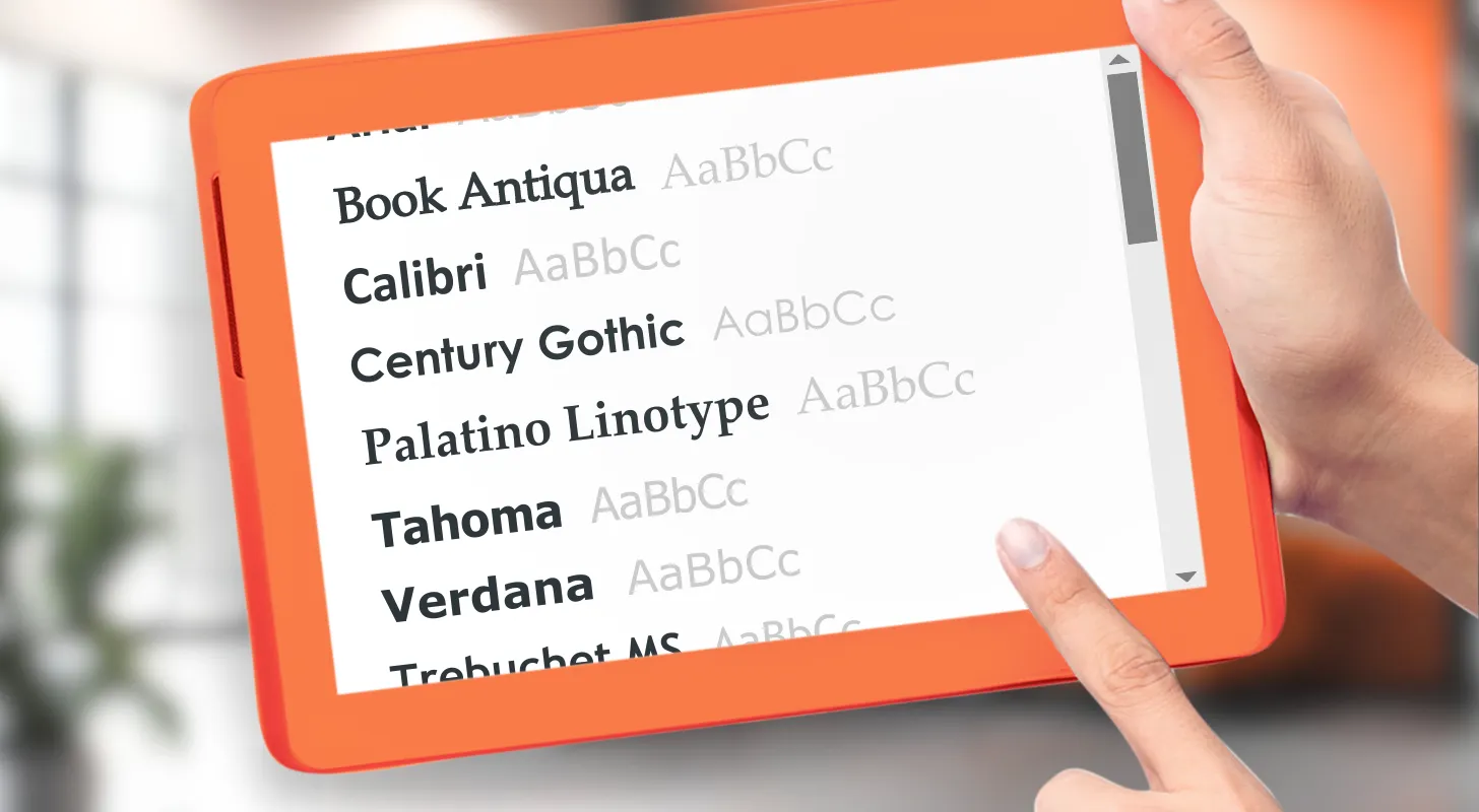
One thing is clear, it is in your best interest to use web-safe fonts, otherwise, you run the risk of different email clients not supporting different fonts in your signature. In our app, we’ve got you covered—all our fonts, whether serif or sans serif are web-safe.
Choosing the right font for your email signature template helps you inscribe the brand personality in every single word of your messages. Whether you choose dependable Book Antiqua, practical Tahoma, clear Verdana, or majestic Palatino Linotype, keep in mind the readability, compatibility, aesthetics, and font pairings that best suit you and your recipients. After integrating your brand colors, the email is ready to go.
Fancy a bit of a gamble? Learn about using custom fonts with SignatureSatori that aren’t web-safe in our article Can I use custom fonts in my signature? in our Help Center.

